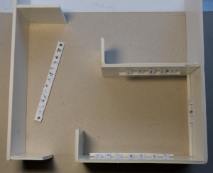
Layout plan for up in coming July Assessment:
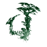
Aerial view of my space: Entry is bottom left - as you enter the space you will first encounter a very low white floating shelf with green-black images on paper. A couple of examples of these are: 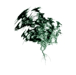
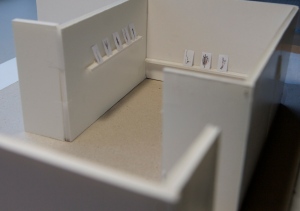
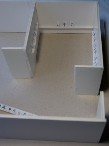
Around the corner there are 3 shelves at differing heights -
The shelf on left containing 5 images being at 1.4m above ground, the one with 3 images on will be 0.6m and on the right, there will be a third at
1.2m with 7 images:
These images will be white on glass (for the model I did them in black otherwise would have been too hard to see). The building of a model has been invaluable each time, considering I do not simply produce one image to hang on the wall, but many. From receiving the plan and the site visit last week, the model was constructed. This has allowed me to move things around and question placement and the varying conversations each piece has with its neighbour, while keeping in mind the context of the works. Realising very quickly that the glass and paper works are 2 responses to my context and that these could not be p laced in the same space. They were like chalk and cheese in the same space and crammed each other. The shelves with the glass images will be white 'floating' (which has been a mind bending exercise to create within a reasonable budget). Installation images to follow

