gallery visits in the city that inspired me;
With the festival of photography on in Auckland, there was bound to be something that was off interest to me.
Two exhibitions in New Market peaked my interest, Joe Sheehan Screenshots at Tim Melville and Kevin Capon, A perfect day at Sanderson Contemporary art. Since I was in the city I also went to see Casey Moore’s, Camera ephemera at FHE Gallery.
The shows in New Market interested me for very different reasons;
Sheehan’s work because the image that was in the festival brochure was captivating and this work was a total change from his normal practice. While Capon’s work created an interest with me, because he photograph’s everyday items and I was interested to see how he did this and how the work would read.
First stop was at Tim Melville to admire Sheehan’s work. Sheehan is more of a stone artist & carver, using mostly greenstone. Sheehan has worked with jade for a long time, influenced by his father, while working in the family business in Rotorua carving for the tourist market. Not wanting to be restricted by history of Jade, Sheehan got inspiration from museum displays of ‘the everyday’, such as weapons and tools carved from greenstone. (Webster)
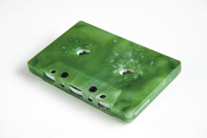
Much of his work is creating real everyday items out of greenstone/nephrite-jade. Such as an empty squeezed plastic bottle, carved from Greywacke (Mother, 2007) or a
cassette case (Song remains the same, 2004), complete with the music in it, are the norm for Sheehan.
They are very tactile pieces, that are everyday items, that is what his practice has been. This current work is a complete contrast, they are photographic images of thinly, backlit slices of greenstone. This new series of works are concerned with capturing of light.
To quote the artist statement page:
“Traditionally images of jade/greenstone/Pounamu have been bound to commercial, political or cultural values. In Sheehan's new imaginative space the limitations are removed and his photographs explore new ways by which 'greenstone as image' can operate as artistic expression. More than just images of sliced and carved stones these works are photographs of projected light”. This artist statement was short and easy to access.
The images look like aerial shots of parts of mountains, rivers and bush. They are captivating and mesmerizing, taking you away from where you are, standing in a gallery, to a place of calm, sun, wind and even bird sound.
There were 2 sizes of framed images, the larger were very overpowering and swallowed you into the ‘landscape’. The biggest challenge I found was the use of reflective glass on these images, as the lighting etc of the gallery was also reflected in the glass, besides yourself. The smaller images did not have this reflection concern. They were intimate and it felt like being drawn into a special part of the world. A secret hide away, which the artist was willing to share on a one to one basis.
It was a privilege to both see this work and visit this gallery, as they were welcoming and friendly.
Next stop A perfect day at Sanderson Gallery. Kevin Capon artist statement was long and cumbersome to read. The words felt like justification for what are images of ordinary every day things.
I purposely viewed the work first before I read the statement (something I always do, as feel any art work has to be first viewed first to create my own interpretation of it). The work was quirky and easily recognizable. What it failed to do for me, is transport me somewhere else, there was no mystery for me.
The artist statement felt too prescriptive, to directing in what the artist felt the audience should experience.
I did enjoy a couple of the works; A perfect day (2014) of a happy couple enjoying each others company walking out doors. An apt title for this work, as the sun was on her face, she was smiling and he looked at her with some affection. And Narcissus (2013), a black and white image of a single daffodil flower. Where the stem disappears and the lighting used created simple reflections on the side of the stem. Why did this appeal? It was a singling out of a spring flower, which we rarely see elevated to this level. They are bought in bunches, they sway in bunches in the field, they are naturally bright and sun like. Here it was subdued, alone in the dark, made vulnerable and the focus. (But then I am a sucker for anything botanical)
It was still very valuable to see this show, am glad I made the effort.
After this I was off to Central Auckland to Camera ephemera at FHE gallery;
I first saw work by Casey Moore at the art fair a couple of years ago. It was again the botanical images that caught my eye then.
Moore is a London based photographer, with a fascination for NZ subjects. The works at FHE are a combination of older and new work. Since FHE has 2 gallery spaces, the old and new were in the separate spaces.
The black and white, Fiordland Botanical studies were all together in the smaller space. Since they were large prints, they inhabited the space, creating a sense of the bush had come to town. These large in focus close-ups, show the detailed symmetry that attracted Moore to these plants.
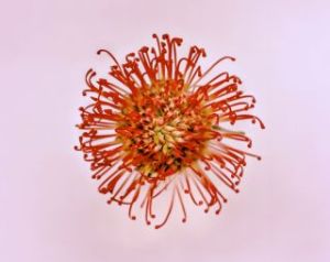
In contrast the flower works were in colour, in a larger gallery space, single flower heads, which were out of focus.
This out of focus was a deliberate act by Moore, his aim was to create tension for the viewer. I found this challenging, especially in combination with the use of non reflective glass. The inability to stand in front of a work, because your own reflection and the gallery space around you is reflected in the glass, meant you had to view the works from a slight angle. The search for something that was in focus became too hard with all the reflections.
What was appealing was the fact that the images did not have a border of any sorts. The image was framed by the frame, it did not require the extra border from a matt or white space.
The singling out of flowers, without stems, foliage or any other grounding element made created a sense that the flower was floating, free from attachments. This was in contrast to the B&W Fiordland Botanical Images, as they were all grounded, by being connected to the bottom of the frame with their stems.
Seeing both the B&W and colour images on the same day was extremely useful.
Other technical aspects I got from visiting these 3 hows were:
- Framing - Use of square or angles frames. Either of these create a different look to the images.
- Framing with white border which is not a matt - this was done with both Sheehan and Capon’s work. It created a cleaner look and in Sheehan’s case some of the images looked like that were 3D.
NOTE: I am not an exhibition reviewer, but go to see these shows to learn more about other artist, how they work and be inspired by their work.
Web pages used or visited to support this blog:
Joe Sheehan:
http://www.timmelville.com/artists/showArticle.php?file=joesheehan.xml
http://www.pataka.org.nz/2012/08/joe-sheehan/
http://www.thearts.co.nz/artist_page.php&aid=84
Webster, Kathryn. Joe Sheehan - Inspiring New Zealand. AA Directions Magazine. Accessed 10 June 2014 http://www.aa.co.nz/membership/aa-directions/features/joe-sheehan-inspiring-new-zealand/
Joe Sheehan. Screenshots. http://timmelville.com/exhibitions/showArticle.php?file=06_03_joesheehan.xml&year=2014¤t=yes#/img/1
Image sourced from; http://www.pataka.org.nz/2012/08/joe-sheehan/
Kevin Capon:
http://www.sanderson.co.nz/Artist/120/Kevin-Capon.aspx
Casey Moore
http://www.fhegalleries.com/artists/showArticle.php?file=caseymoore.xml
http://www.fhegalleries.com/exhibitions/showArticle.php
Image sourced from : http://www.fhegalleries.com/exhibitions/showArticle.php


