April Seminar Critique notes & self reflection:
Artist statement that went with this work:
confusion creates a rift in the natural order
they establish a footing in confusion
they take advantage of our living methods
they follow where we go
our disturbances create their living spaces
left to their own device
they create a secret solitary life
in that abandoned disruption
as shadows - there, but not seen
covering the forgotten
a scar of a journey past
the flower that remembers
Elle Anderson
April 2014
April 2014 - Peer Critique 1
- Leave an impression of plant
- White images are half cut out
- With coloured image amongst them, know what the rest are - gives a clue
- Do question if they are all of same plant
- Look dry, dead
- Uprooted, still have roots - is a double inversion, as the plant is upside down and the image is back to front
- Question of a scale; are they as a 1:1 scale or scaled to fit the paper size?
- Paper quality - question around this, was this best solution or is this where the project is at this stage?
'White’ images:
- Extinct - cut out gives impression of what was and what is no more
- Sense of personality - they are little characters, anthropomorphic (having human/animal qualities) quality
- Concern - black & white could be a value game, which is strong influence of past work. This also creates the feeling of good vs bad -weeds
- Has a drawing quality to it
- Cutting & shadowing & curvature of paper - this created question if plant was flattened behind it
Coloured image:
- Darker image in middle - can be distracting - question it raises, is it there to emphasize or place importance or for help to interpret the others
- Is it in the right place? Does it belong amongst the other 4?
Art statement
very poetic, relates more to artist and than to work
Considerations for further development:
- Composition; layout on individual page, placement of image on page
- Quantity
- Size/Scale of image - larger, would remove it out of the ‘cabinet’
Peer Crit 2
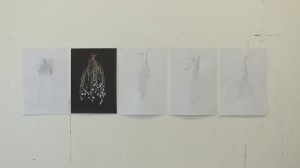
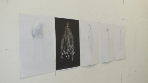
- A3 paper with 4 White, where image is turned to wall and 1 coloured, which is facing towards viewer.
- Images are hung close together
- Positive and negative
- 4 sculptural and 1 visual/image
- Sense of body - lungs, veins, bronchial
- Questions why they are hung that way? Who was person making them? What is going on?
‘White’ images:
- Cuts in paper
- Visual trace of image coming through paper, not always tactile
- Desire to touch - did touch when nobody was in rom
- Embosing on surface
- Marks made on other side - creates desire ot see other side, viewer standing close to wall to try see other side
- Veils
- The B&W image on left of coloured one feels left out.
- Very ambiguous
- Elements of dance, animals/creatures
- Cold analytical/surgical/systematic narrative
- Surgical incision
Coloured one:
- Still life, Dutch heritage strong in this one
- Feels like a marker
- Gives clue to the B&W images
- Gives suggestions how the others may have been done
- Adds assumption that the B&W are also printed, not drawn
- Relates to body & natural medicine
- Does it belong where it is placed?
Artist statement:
Poetic form
Does reinforce ambiguity of White works, but not of the coloured work
Does not relate to the strong incisions on white works
My own comments and thoughts on this work as I had documented it before the critiques happened. I feel it is a valuable addition to these critique notes:
Work that I presented was:
- 5 A3 images of which one was coloured and the rest were B&W
- They were presented as a series of 5
- B&W images showed the back of the image - through the back of the paper the image was barely visible.
- B&W images were partially cut from the paper
- The coloured image showed full detail of the plant, where the plant was suspended in a black space.
Rationale behind this work (taken from my notes before I had the peer critiques at uni):
The original intent of this work was based around value:
What do we value?
Do we value a coloured image more then a B&W image?
By cutting into the B&W images, I was hoping to portray that more value was placed on the coloured one, because it was not cut.
Once the work was hanging on my wall at home I realized that something else was going on:
It was more playful than I had intended, as the cut out parts (through the shadows created by the lighting) became animals.
There was a positive - negative happening - reinforced through the use of Monochrome and Coloured image
Monochrome images:
- The monochrome images had a there and not there push and pull going on.
- Gravity helped plant appear - interesting part to this was that the plant would then be the right way up - it was like a peeling back, looking to find, seeing behind a mask, a hint of something, shadow play & puppetry.
- Reminder of wall paper peeling away, revealing past history
A friend called them:
- Anthropomorphic
- The secret life of weeds/plants
- Possibly the underbelly of weeds.
Coloured image;
- Felt like a grounding image
- It provided a starting point for the other 4, maybe a plinth for the other works to sit on.
- Showing the staring point
Before the April crit seminar week I did experiment with other paper and larger images on this paper. But experienced trouble with the cutting and small incisions I was trying to make - because the paper was either good quality photographic paper or printing paper the fibre’s in the paper would not cut clean (no matter how many clean blades I put in my scalpel)
For the critiques I decided it was better to take along the A3 photocopy paper images, as they had cleaner cuts. It was very much a work in the early stages of development
The trouble this caused me:
I had only created this work in the last 2 weeks before the critique and so I did not fully own the work, nor understood the works potential.
This made me unsure during my critique sessions and especially during the faculty critique - It exposed my own unsure ‘underbelly’.
Now having had a few days to let the work sit in the dark and revisiting it, through making these notes, I realize more strongly that I did not achieve my original intend, that I should not have hung them how I did. That combining the coloured & Monochrome images as I did, was not strengthening the work.
More time with the work before the crit’s would have helped to consolidate my own understanding of the work better, both its potential and it’s down falls.
From this and comments made during my faculty crit I now know that what I first need to do - to go back to my question I posed myself a year ago:
Am I still true to this with my work? Have I moved away from its intend? Do I need to revisit the question and clarify it better or clearer?
Revisiting this will help provide a stronger base for the content of my work and provide me with a clearer road map for not just the next 9 months of my Master’s, but also for my arts practice beyond the Master’s.


